
what makes a photograph feel expensive?
I've always found it interesting that some photographs can make a fairly ordinary object look incredibly desirable, while others can photograph something objectively beautiful and somehow make it feel a bit ‘meh’.
And no, I don't think the answer is always to use more expensive things.
For me, photographs that feel expensive usually have one thing in common: they feel intentional.
Someone has thought about what belongs in the frame, where the light is coming from, what the eye should notice first and what can be left out. If the lighting looks flat, it’s intentional. If the styling feels full to the brim, it’s intentional. If the colour palette is overly muted or overly bright, it’s intentional.
It doesn't necessarily mean polished. It doesn't necessarily mean minimal. And it definitely doesn't mean everything has to be beige.
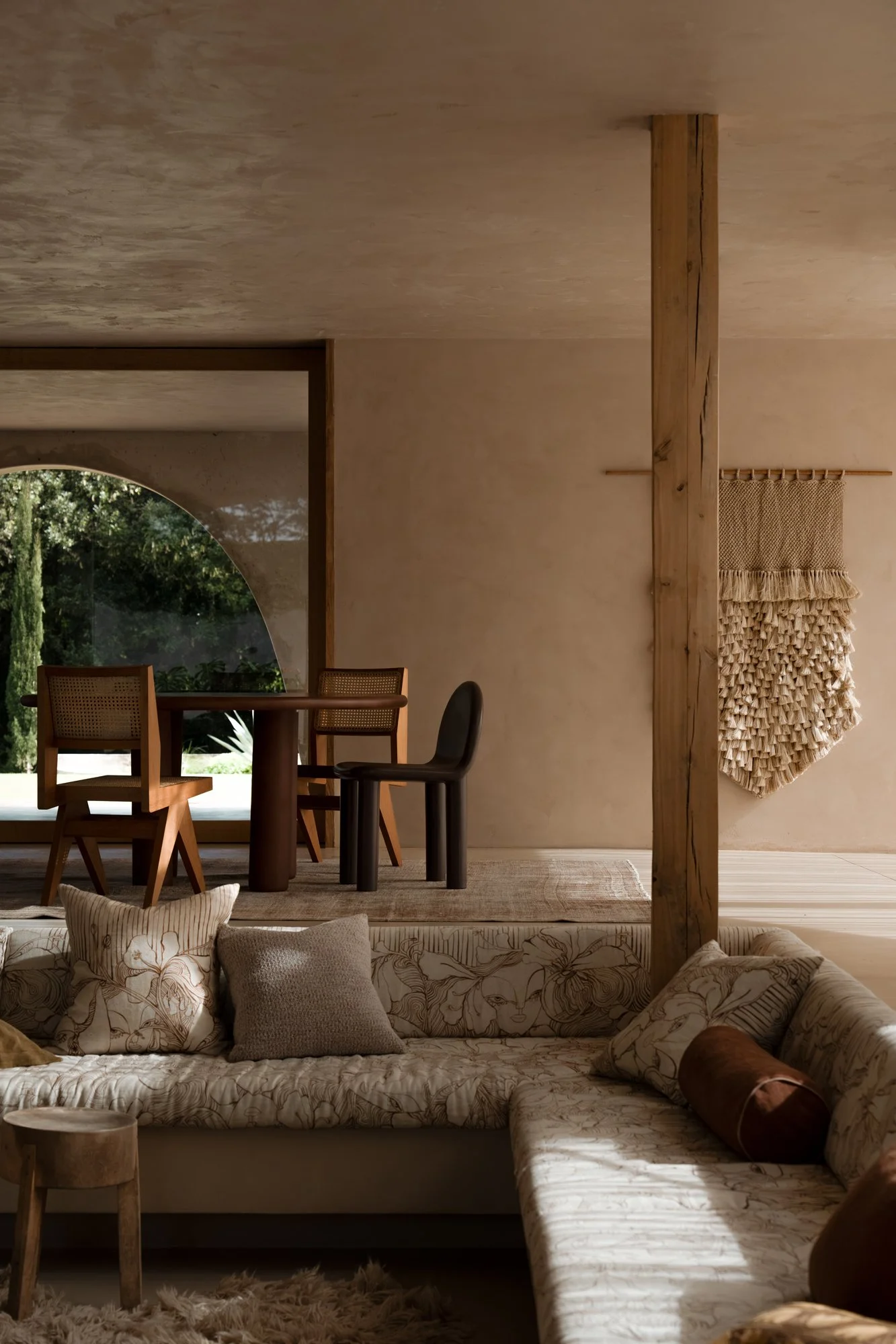
it's light —
Light is one of the first things I notice. Especially when it’s working against the image rather than elevating it.
Beautiful light can make a simple image feel incredibly considered, while flat or inconsistent light can make even the most beautiful subject lose a bit of its magic.
I'm especially a fan of directional light, and the depth it creates. Give me a good side-lit moment or some sunlit shadow play any day.
Good light creates shape, depth and atmosphere. It gives the photograph somewhere for your eye to move.
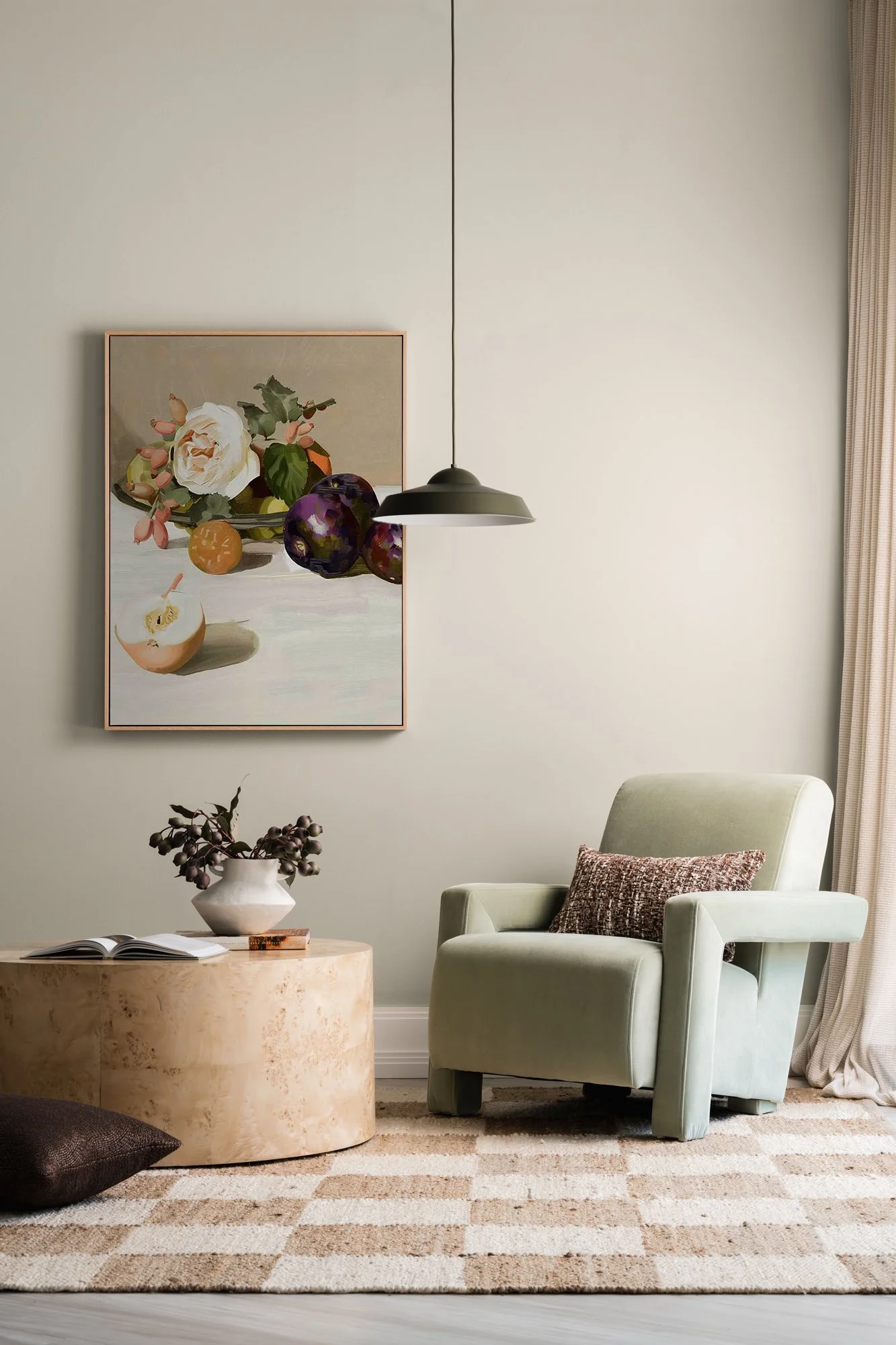
it's composition —
A photograph can contain all the right things and still not quite work.
That's usually where composition comes in.
Where is the subject sitting within the frame? What is happening in the background? Is there enough breathing room? Are there too many competing elements? Where does your eye land first? How does it move around the image after that?
Sometimes the difference between a shot feeling disjointed and feeling considered is moving something 5 centimetres to the left.
This is why I'm constantly moving things around on a shoot.
Not because I'm indecisive.
Because I am very decisive about those 5 centimetres.
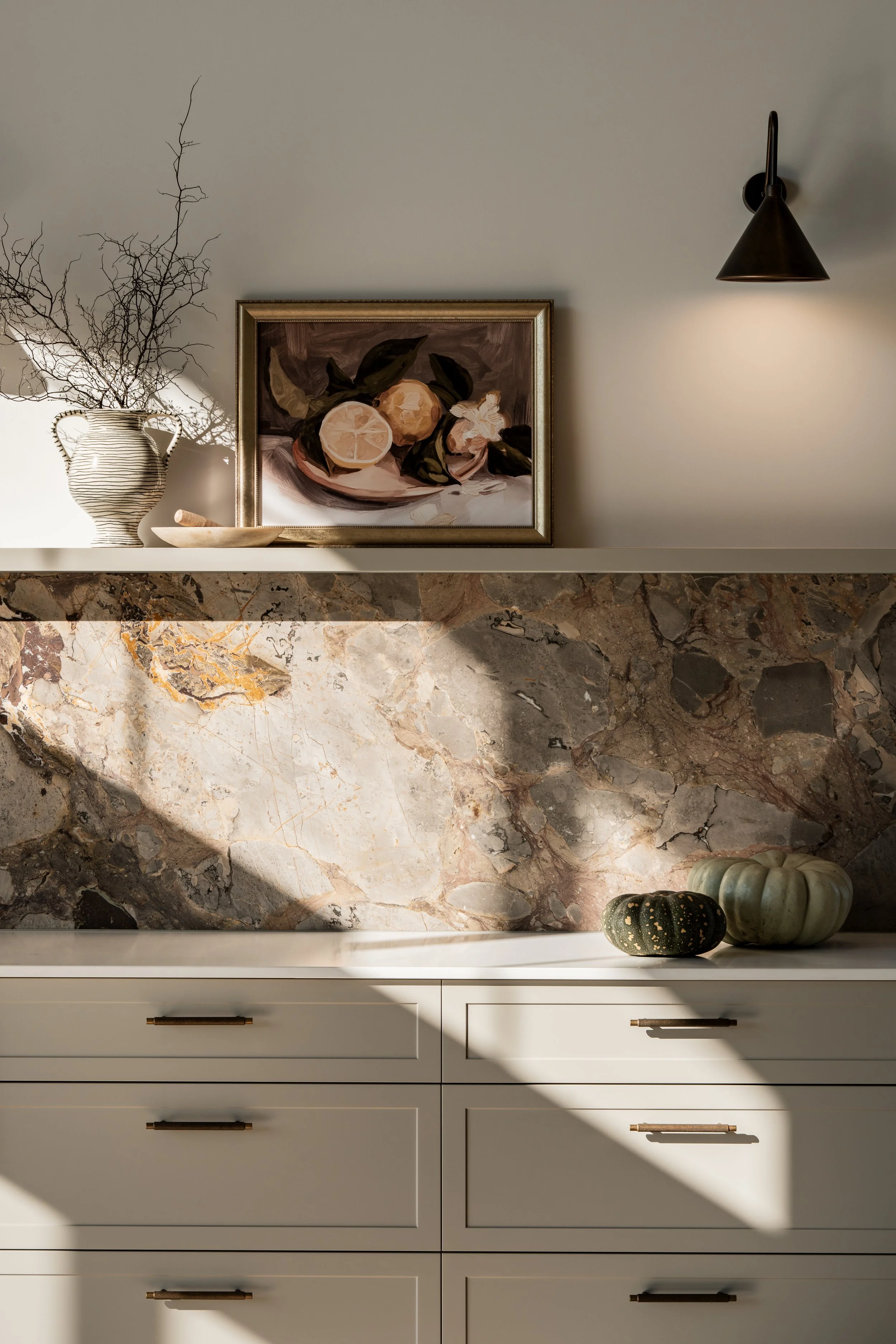
it’s styling —
Styling isn't about filling a photograph with beautiful objects. In fact, sometimes good styling means taking things away.
The right props can add colour, texture, scale or context. The wrong ones can completely hijack the image.
It's also about balance, composition and knowing when an image needs a little more, or a little less.
Styling is where the personality of an image can really come through. I love including small details that make an image feel connected to a person, place or moment in time.
A stack of books. A slightly wonky vase. A chair with a bit of history. A piece of fruit mid-cut.
Good styling should make an image feel considered without making you notice the styling first. It should feel authentic. It should hold your gaze and create interest.
Ultimately, it's about creating a frame that feels intentional, but never overly constructed.
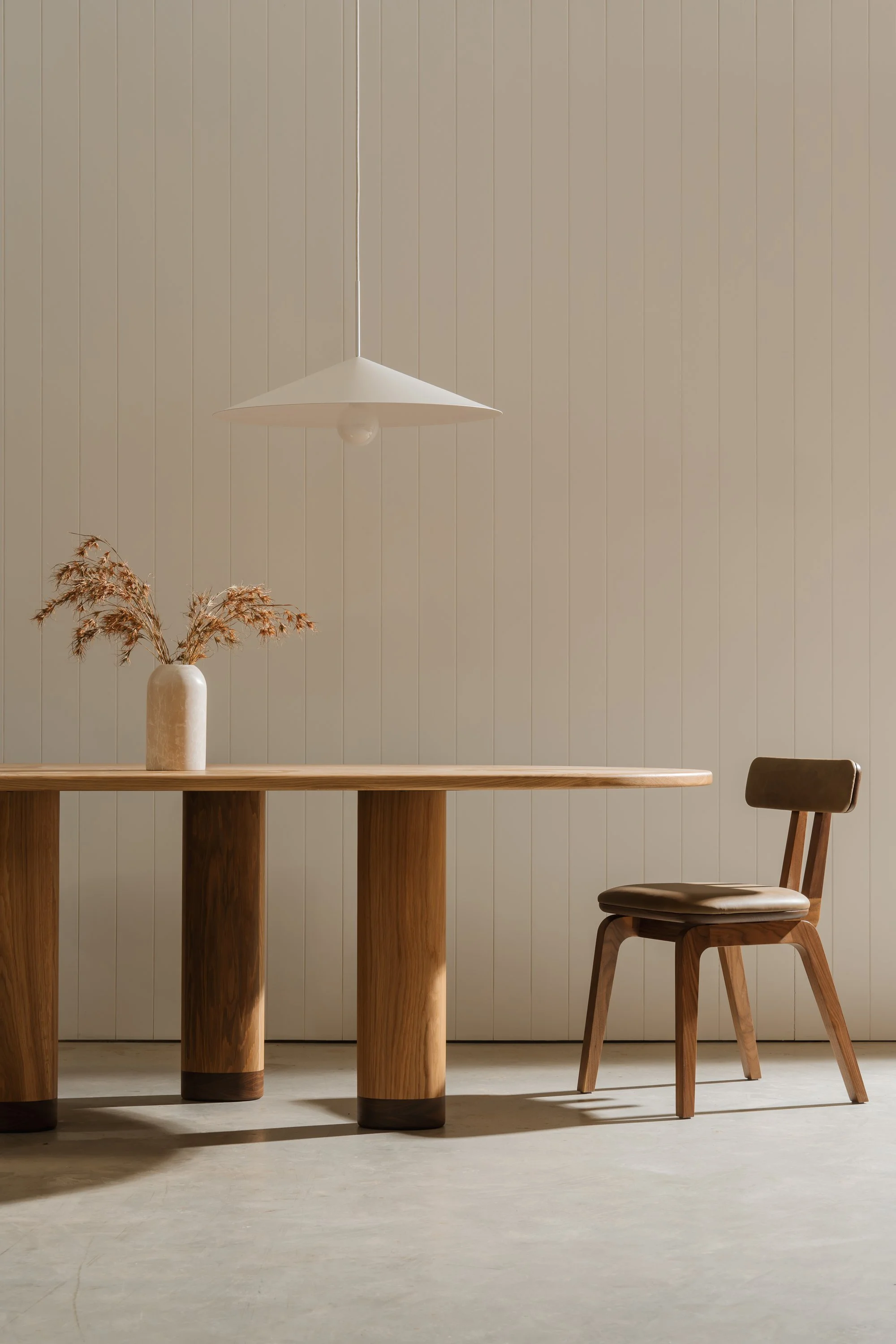
it's restraint —
This one is a big one.
When you're trying to make an image feel impressive, it's very easy to keep adding.
Another prop. Another colour. Another texture. Another thing in the corner because that corner feels a bit empty.
Sometimes the most expensive-looking decision you can make is to leave something out.
Give the hero product some room.
Let the architecture breathe.
Don't make every object compete for attention.
Not every part of a photograph needs to shout.
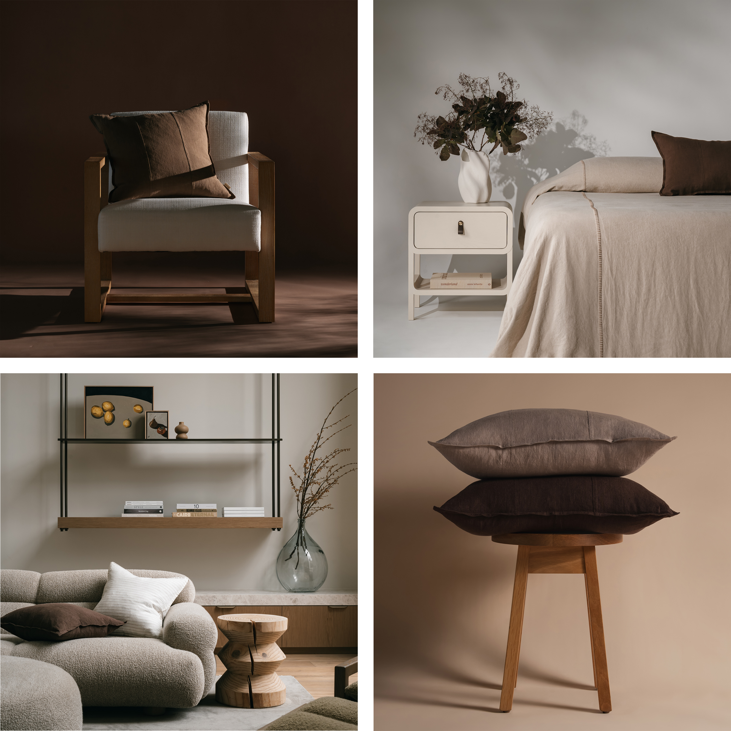
it's consistency —
One beautiful photograph is lovely.
A collection of beautiful photographs that feel like they belong together is much more powerful.
This is particularly important for brands.
If your website has one visual language, your Instagram has another and your latest campaign has wandered off into an entirely different universe, even great individual photographs can start to feel disconnected.
A considered image library should feel cohesive without being repetitive.
Same world. Different moments.
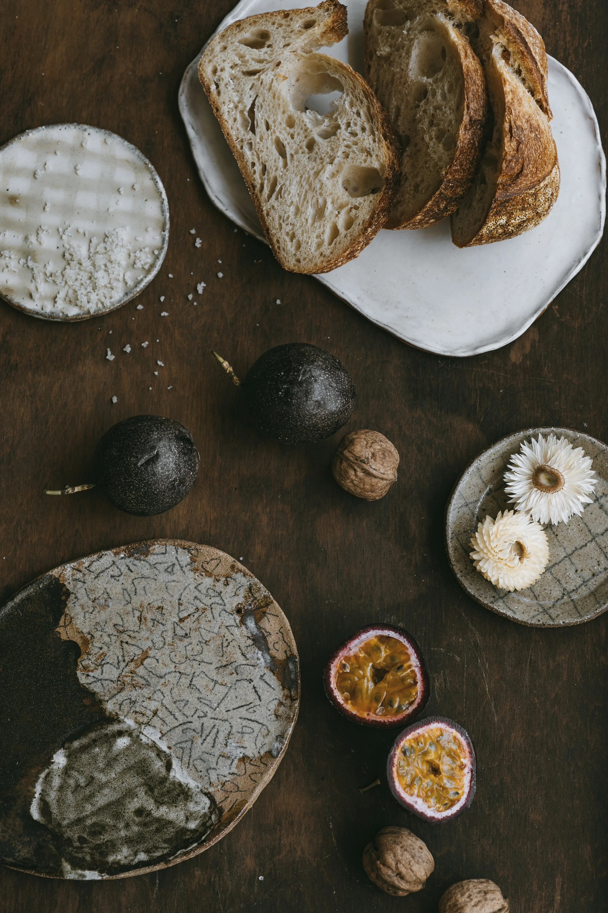
it's the details —
This is where my styling brain really kicks in.
There are so many little details that come into play when I'm building a frame, and it's often the smallest adjustments that make the biggest difference.
The way a curtain falls.
The angle of a chair.
The way a piece of furniture sits within a space.
A shadow across a wall.
The way florals in a vase sit.
The way a texture catches the light.
The tiny shift of something that's just slightly not quite right.
These are the things I'm constantly looking at, moving, tweaking and playing with when styling and capturing a shot. On their own, they're tiny decisions. Put them all together, and suddenly the whole image just clicks.
That's the stuff that takes a photograph from nice to “oh daaamn.”
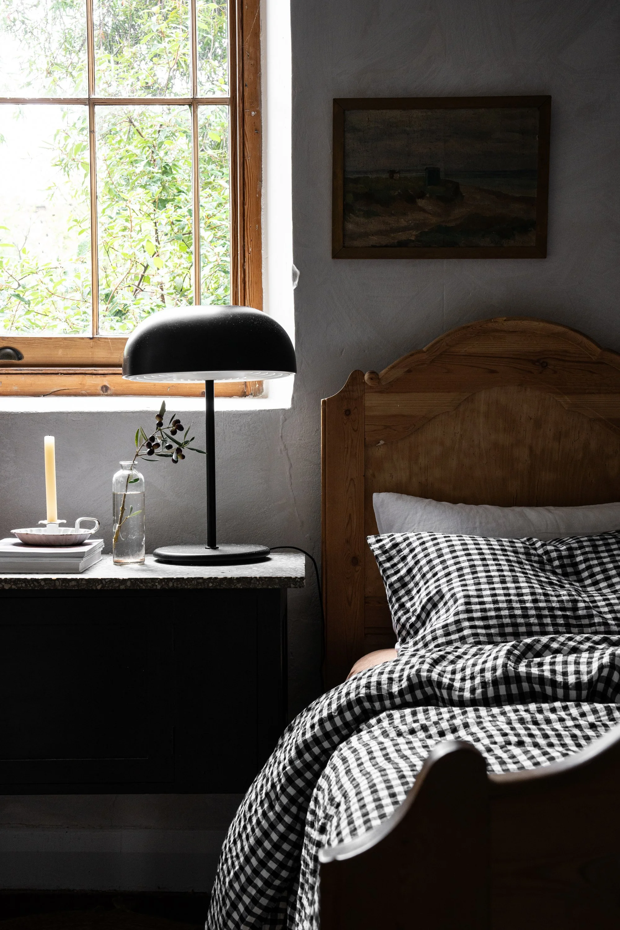
and sometimes, it's the unexpected —
I don't think expensive-looking imagery needs to look perfect or predictable.
Actually, some of my favourite images are the ones where there's something slightly unexpected happening.
A modern lamp in an old house.
A brightly-coloured object in an otherwise muted room.
A painting leaning against a wall rather than hanging perfectly.
A product that's clearly been used.
A candid moment caught between poses.
Those little moments of contrast give your eye somewhere to land. They interrupt the expected and make you look twice.
Perfection can be beautiful, but a little tension is interesting.
It's often the unexpected detail, colour, shape or moment that makes an image feel memorable rather than just nice to look at.
And that's a good thing. You want people to pause, look a little longer and feel curious about what they're seeing.
so, what actually makes a photograph feel expensive?
Not the camera.
Not the size of the budget.
Not whether the vase cost $40 or $400.
It's the feeling that someone made a series of thoughtful decisions before pressing the shutter.
Good light. Strong composition. Considered styling. Restraint. Texture. Consistency. A point of view.
Basically, less “look at all the beautiful things I own” and more “everything in this frame is here for a reason”.
That's usually where the good stuff lives.
If you're curious about what goes into creating those images commercially, I've also written about how commercial photography works.
Want imagery that feels considered, not cookie-cutter? Let's talk about your next project.